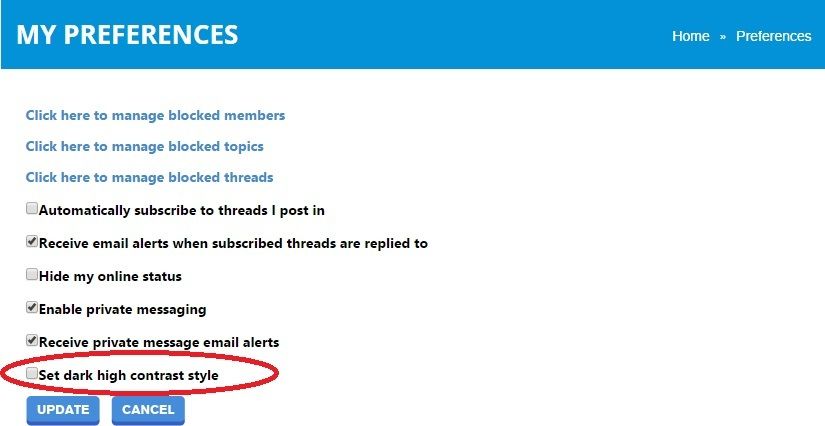
Thread Rating:

Zuga
Administrator
Zuga
  • Threads: 50
  • Posts: 446
Joined: May 21, 2014
August 8th, 2015 at 3:17:14 PM permalink
So per some of the suggestions we have made a darker contrast background style. To choose it go to your profile -> preferences -> Set dark high contrast style

As far as this style goes let us know how you like it and if any changes would be required .


cheers
Zuga
"All it takes for evil to prevail is for good people to do nothing "
EvenBob
EvenBob
  • Threads: 441
  • Posts: 28571
Joined: Jul 18, 2010
August 8th, 2015 at 4:04:23 PM permalink
Far better than the white.
"It's not called gambling if the math is on your side."
texasplumr
texasplumr
  • Threads: 13
  • Posts: 343
Joined: Mar 6, 2011
August 8th, 2015 at 4:52:57 PM permalink
I think I like this. Will have to see how I like it on my laptop.
Thanks.
Stupid is a choice
Mikey75
Mikey75
  • Threads: 49
  • Posts: 639
Joined: Mar 1, 2013
August 8th, 2015 at 5:11:51 PM permalink
I definatly like the dark better than the white.
Mission146
Mission146
  • Threads: 142
  • Posts: 16832
Joined: May 15, 2012
August 8th, 2015 at 5:47:21 PM permalink
This is an improvement over the old version with the dark contrast, now!
https://wizardofvegas.com/forum/off-topic/gripes/11182-pet-peeves/120/#post815219
Zuga
Administrator
Zuga
  • Threads: 50
  • Posts: 446
Joined: May 21, 2014
August 8th, 2015 at 7:01:38 PM permalink
Thx for the replies guys and glad that EB finally found something he likes :p
"All it takes for evil to prevail is for good people to do nothing "
DJTeddyBear
DJTeddyBear
  • Threads: 207
  • Posts: 10992
Joined: Nov 2, 2009
August 8th, 2015 at 7:01:38 PM permalink
Although I originally didn't like the text color of the new version, once it was changed, I didn't have a problem with it.

And I like the white BG a LOT better than the dark BG. At least on my laptop. Gotta check the iPhone.


Yeah, I know. There's one in every crowd...
I invented a few casino games. Info: http://www.DaveMillerGaming.com/ ————————————————————————————————————— Superstitions are silly, childish, irrational rituals, born out of fear of the unknown. But how much does it cost to knock on wood? 😁
Zuga
Administrator
Zuga
  • Threads: 50
  • Posts: 446
Joined: May 21, 2014
August 8th, 2015 at 7:05:00 PM permalink
Quote: DJTeddyBear

Although I originally didn't like the text color of the new version, once it was changed, I didn't have a problem with it.

And I like the white BG a LOT better than the dark BG. At least on my laptop. Gotta check the iPhone.


Yeah, I know. There's one in every crowd...


I personally prefer the white so you are not alone :). this new optional BG is for those that disliked the white.
"All it takes for evil to prevail is for good people to do nothing "
TwoFeathersATL
TwoFeathersATL
  • Threads: 37
  • Posts: 3616
Joined: May 22, 2013
August 8th, 2015 at 7:23:16 PM permalink
Quote: Mikey75

I definatly like the dark better than the white.


Holy crap!
We, you and me, have created a monster.
Now I got blue text on almost black background.
I do believe I will puke on my tablet if I leave it that way.
But now I'm typing almost black text on an almost white background... .?
I am tempted to put together a long string of obscenities, only tempted momentarily.
I took a breath, I told another member not too long ago to just take a breath, a big one, and then another.

(Edited)

The whole color thing still sucks, I cannot breathe it away, I tried, I tried hard ;-)
Youuuuuu MIGHT be a 'rascal' if.......(nevermind ;-)...2F
Ibeatyouraces
Ibeatyouraces
  • Threads: 68
  • Posts: 11933
Joined: Jan 12, 2010
August 8th, 2015 at 7:30:45 PM permalink
Quote: Mikey75

I definatly like the dark better than the white.


Racist! J/K :-)
DUHHIIIIIIIII HEARD THAT!
Dodsferd
Dodsferd
  • Threads: 1
  • Posts: 375
Joined: Jun 10, 2015
August 8th, 2015 at 8:32:24 PM permalink
Quote: Zuga

I personally prefer the white so you are not alone :). this new optional BG is for those that disliked the white.


I also prefer the white over the dark theme. I find it less strenuous to use the light theme over the darker colors
This feeling is heavy, makes my body ache and I'm ready; To fall into the sky and I see now, the reason why. My heart is heavy, takes me to a place I can't breathe. Only then I know why I see the warning sign.
odiousgambit
odiousgambit
  • Threads: 326
  • Posts: 9555
Joined: Nov 9, 2009
August 9th, 2015 at 5:26:33 AM permalink
definitely better
the next time Dame Fortune toys with your heart, your soul and your wallet, raise your glass and praise her thus: “Thanks for nothing, you cold-hearted, evil, damnable, nefarious, low-life, malicious monster from Hell!”   She is, after all, stone deaf. ... Arnold Snyder
MaxPen
MaxPen
  • Threads: 13
  • Posts: 3634
Joined: Feb 4, 2015
August 9th, 2015 at 11:19:16 AM permalink
I think it is appropriate that the new logo next to the title in the browser tab looks like a shark fin protruding from the water, when all small like that, considering that this website has seemed to have jumped the shark.
EvenBob
EvenBob
  • Threads: 441
  • Posts: 28571
Joined: Jul 18, 2010
August 9th, 2015 at 2:21:41 PM permalink
Background looks good, but everything has slowed
down again. Takes 7-8 seconds to load anything.
It was real fast the first few days. This always happens
here, every time they update the server it's fast at
first, and then slows back down in a few days.
"It's not called gambling if the math is on your side."
Zcore13
Zcore13
  • Threads: 41
  • Posts: 3808
Joined: Nov 30, 2009
August 9th, 2015 at 4:40:44 PM permalink
They could clean up the database by purging non participating members. There's about 4,000 of them. That can't be helping the speed.


ZCore13
I am an employee of a Casino. Former Table Games Director,, current Pit Supervisor. All the personal opinions I post are my own and do not represent the opinions of the Casino or Tribe that I work for.
TwoFeathersATL
TwoFeathersATL
  • Threads: 37
  • Posts: 3616
Joined: May 22, 2013
August 10th, 2015 at 7:44:59 AM permalink
Quote: Dodsferd

I also prefer the white over the dark theme. I find it less strenuous to use the light theme over the darker colors


Tried the dark background with light text again, just for fun.
Still not fond of it but was not tempted to puke on the screen this time.
But this reply? Well it goes back to the small almost black text on a large almost white background. If I were sitting in a dark room, reading the light text on a dark background, and then hit reply or quote and this screen jumped out at me? I'd probably fall off my barstool, once again......

I think I will change back to the latest former, and leave the latest latter to those that like it.

Nice try though! 2F

Ps: Still think the Avatars should be bigger, can't tell much about Dodsferd's latest.
If you/they/we/it even like the 'Avatar concept' that is...
I have looked at some under magnification and still can't figure out what I'm looking at.
I did not specifically mention BABB's, or sevaral others in particular, no I did not. ;-)
Youuuuuu MIGHT be a 'rascal' if.......(nevermind ;-)...2F
beachbumbabs
beachbumbabs
  • Threads: 100
  • Posts: 14260
Joined: May 21, 2013
August 10th, 2015 at 6:06:43 PM permalink
Quote: TwoFeathersATL

Tried the dark background with light text again, just for fun.
Still not fond of it but was not tempted to puke on the screen this time.
But this reply? Well it goes back to the small almost black text on a large almost white background. If I were sitting in a dark room, reading the light text on a dark background, and then hit reply or quote and this screen jumped out at me? I'd probably fall off my barstool, once again......

I think I will change back to the latest former, and leave the latest latter to those that like it.

Nice try though! 2F

Ps: Still think the Avatars should be bigger, can't tell much about Dodsferd's latest.
If you/they/we/it even like the 'Avatar concept' that is...
I have looked at some under magnification and still can't figure out what I'm looking at.
I did not specifically mention BABB's, or sevaral others in particular, no I did not. ;-)


Mine is of the Cessna 150 I earned my pilot's license in, with two folding chairs under the wing. Another pilot on here recognized it immediately; no one else has said anything either way. It's distorted the same way all my other attempts have been, making something round into a tall oval by compressing the sides.

The dark background worked ok for me, but not all of the site adapts to the setting; for example, PM's are still in thin black font; against a dark background, they're unreadable. Also the blue and green names work ok on it, but the red "dithers" (I don't know the right word for it, the pixels zig-zag sort of) and is very hard to read. All FWIW; I'm back to the lighter background as well.
If the House lost every hand, they wouldn't deal the game.
Face
Administrator
Face
  • Threads: 49
  • Posts: 4448
Joined: Dec 27, 2010
August 10th, 2015 at 7:25:34 PM permalink
Quote: beachbumbabs

Mine is of the Cessna 150 I earned my pilot's license in, with two folding chairs under the wing. Another pilot on here recognized it immediately; no one else has said anything either way.


I definitely noticed, I just didn't say anything. I pass the local strip every day on my route, they're one of my stops. I think about you and our convo every single time =)

Someday...
The opinions of this moderator are for entertainment purposes only.
MaxPen
MaxPen
  • Threads: 13
  • Posts: 3634
Joined: Feb 4, 2015
August 10th, 2015 at 11:52:42 PM permalink
Quote: MaxPen

I think it is appropriate that the new logo next to the title in the browser tab looks like a shark fin protruding from the water, when all small like that, considering that this website has seemed to have jumped the shark.


The big W looks much better.
AxelWolf
AxelWolf
  • Threads: 164
  • Posts: 22272
Joined: Oct 10, 2012
August 11th, 2015 at 3:13:05 AM permalink
PMs are light grey on dark grey like quoted text here, it's really hard to read them.
♪♪Now you swear and kick and beg us That you're not a gamblin' man Then you find you're back in Vegas With a handle in your hand♪♪ Your black cards can make you money So you hide them when you're able In the land of casinos and money You must put them on the table♪♪ You go back Jack do it again roulette wheels turinin' 'round and 'round♪♪ You go back Jack do it again♪♪
Zuga
Administrator
Zuga
  • Threads: 50
  • Posts: 446
Joined: May 21, 2014
August 11th, 2015 at 10:01:37 AM permalink
PM text colour on the dark contrast is now fixed.
"All it takes for evil to prevail is for good people to do nothing "
TwoFeathersATL
TwoFeathersATL
  • Threads: 37
  • Posts: 3616
Joined: May 22, 2013
August 11th, 2015 at 10:10:43 AM permalink
Quote: Zuga

PM text colour on the dark contrast is now fixed.


Yep, that seems to be fixed.
To quote or reply to a post still brings up the almost glaring white screen....
Fell off my barstool again, I'll be back later, chips are on the floor, need a new drink, etc...;-)
Youuuuuu MIGHT be a 'rascal' if.......(nevermind ;-)...2F
Zuga
Administrator
Zuga
  • Threads: 50
  • Posts: 446
Joined: May 21, 2014
August 11th, 2015 at 10:13:43 AM permalink
Quote: TwoFeathersATL


To quote or reply to a post still brings up the almost glaring white screen....


R we still talking black BG here?
"All it takes for evil to prevail is for good people to do nothing "
TwoFeathersATL
TwoFeathersATL
  • Threads: 37
  • Posts: 3616
Joined: May 22, 2013
August 11th, 2015 at 10:25:42 AM permalink
Quote: Zuga

R we still talking black BG here?


I think the answer is 'yes'.
If you/he/me picks the alternative 'light text against a dark background' and then hit's "post", or "quote", then you get a white (OK light grey) screen to type in, with black text. I hope that makes sense, my experience, accessing the site thru a tablet, on home networked WiFi.

You're doing great BTW.
If it were my site, I'd have told everyone that complained to kiss my a$$ a long time ago.
Carry on.....I'll follow......
Youuuuuu MIGHT be a 'rascal' if.......(nevermind ;-)...2F
Zuga
Administrator
Zuga
  • Threads: 50
  • Posts: 446
Joined: May 21, 2014
August 11th, 2015 at 10:54:07 AM permalink
Quote: TwoFeathersATL


If you/he/me picks the alternative 'light text against a dark background' and then hit's "post", or "quote", then you get a white (OK light grey) screen to type in, with black text.

.


Ah ok , i see what you mean. We ll see to make that white box easy(er) on the eyes.
"All it takes for evil to prevail is for good people to do nothing "
darthxaos
darthxaos
  • Threads: 14
  • Posts: 87
Joined: Nov 9, 2013
August 11th, 2015 at 11:00:26 AM permalink
Can we get rid of the huge margins on the sides of the page? The actual forum field is incredibly cramped on non widescreen monitors.
Zuga
Administrator
Zuga
  • Threads: 50
  • Posts: 446
Joined: May 21, 2014
August 11th, 2015 at 11:58:39 AM permalink
Quote: TwoFeathersATL


If you/he/me picks the alternative 'light text against a dark background' and then hit's "post", or "quote", then you get a white (OK light grey) screen to type in, with black text.

.

Quote: Zuga

Ah ok , i see what you mean. We ll see to make that white box easy(er) on the eyes.


This is fixed now.

Quote: darthxaos

Can we get rid of the huge margins on the sides of the page? The actual forum field is incredibly cramped on non widescreen monitors.


unfortunately we have no plans on changing this at present time.
"All it takes for evil to prevail is for good people to do nothing "
Chereya
Chereya
  • Threads: 10
  • Posts: 80
Joined: Jun 7, 2015
August 11th, 2015 at 12:08:30 PM permalink
For me, it would be a little easier to read the text in Quote Replies if they were a little lighter/brighter. There's not quite enough contrast between the grey on darker grey. :/ This black Reply box I'm typing in is a little stark - took my eyes a minute to adjust. I like the shades of grey - just would be great to have a little more variation of the greys.

Thank you for making this an option. When I do read on my tablet, it's at night with the lights off, so this helps a ton with the too-bright contrast of the original white backgrounds in a dark room.
Dieter
Administrator
Dieter
  • Threads: 16
  • Posts: 5478
Joined: Jul 23, 2014
August 11th, 2015 at 12:41:54 PM permalink
Quote: TwoFeathersATL

But this reply? Well it goes back to the small almost black text on a large almost white background.


I noticed this too. Very hard to read. Have to use the select-highlight trick (not readily available on mobile).
May the cards fall in your favor.
darthxaos
darthxaos
  • Threads: 14
  • Posts: 87
Joined: Nov 9, 2013
August 11th, 2015 at 2:37:02 PM permalink
why not? I'm not asking to get rid of the ad sidebar, just all that worthless whitespace - make it a display option.
Dieter
Administrator
Dieter
  • Threads: 16
  • Posts: 5478
Joined: Jul 23, 2014
August 21st, 2015 at 12:55:26 PM permalink
There seems to be a problem viewing spoiler text with dark mode enabled.
May the cards fall in your favor.
AxelWolf
AxelWolf
  • Threads: 164
  • Posts: 22272
Joined: Oct 10, 2012
August 21st, 2015 at 1:19:35 PM permalink
Quote: darthxaos

Can we get rid of the huge margins on the sides of the page? The actual forum field is incredibly cramped on non widescreen monitors.

On my PC I set WOV to 175% magnification. I see no adds on the right and no white on the left. I only see what's important. I also have reasonable sized text. It's actthe perfect combination. I have yet to try it on a mobile device or different PC.

I just got a 2 in 1 tablet/ laptop 11.7" quad core windows device. Hopefully it will act the same, I have yet to use it, wish me luck.
♪♪Now you swear and kick and beg us That you're not a gamblin' man Then you find you're back in Vegas With a handle in your hand♪♪ Your black cards can make you money So you hide them when you're able In the land of casinos and money You must put them on the table♪♪ You go back Jack do it again roulette wheels turinin' 'round and 'round♪♪ You go back Jack do it again♪♪
TwoFeathersATL
TwoFeathersATL
  • Threads: 37
  • Posts: 3616
Joined: May 22, 2013
August 21st, 2015 at 4:57:31 PM permalink
Quote: AxelWolf

On my PC I set WOV to 175% magnification. I see no adds on the right and no white on the left. I only see what's important. I also have reasonable sized text. It's actthe perfect combination. I have yet to try it on a mobile device or different PC.

I just got a 2 in 1 tablet/ laptop 11.7" quad core windows device. Hopefully it will act the same, I have yet to use it, wish me luck.


Axel actually posted "wish me luck".
I swear, I saw it.
The market tumbled, again.
Should I be scared?
Youuuuuu MIGHT be a 'rascal' if.......(nevermind ;-)...2F
Zuga
Administrator
Zuga
  • Threads: 50
  • Posts: 446
Joined: May 21, 2014
August 25th, 2015 at 3:03:17 PM permalink
Quote: Dieter

There seems to be a problem viewing spoiler text with dark mode enabled.


this was fixed

cheers
Zuga
"All it takes for evil to prevail is for good people to do nothing "
tringlomane
tringlomane
  • Threads: 8
  • Posts: 6281
Joined: Aug 25, 2012
August 25th, 2015 at 3:10:54 PM permalink
Quote: AxelWolf

It's actthe perfect combination.


Yep. But I hope I never get blind enough to need this size. I think I might rather see the ads...lol
Dieter
Administrator
Dieter
  • Threads: 16
  • Posts: 5478
Joined: Jul 23, 2014
August 26th, 2015 at 12:53:21 PM permalink
(re:spoilers)
Quote: Zuga

this was fixed


Thanks!
May the cards fall in your favor.
  • Jump to: