
New, upgraded and mobile friendly WoV
Having said that, I didn't ever really notice it either. I guess I got used to it.
I did look for the option when I added an avatar though.
slowing down for me. It's hit and miss, on
some things it's fast, on others it's not.
This has always happened every time there
is an upgrade. It eventually goes back to
being nothing but slow.
for the first 2 days after the upgrade, now it's right
back where it was. Takes 10-12 seconds to load a
page. This has always happened on every upgrade
this site has ever had.
Edit: After I posted this it took 16 sec to load the
main page.
Quote: EvenBobHow is the speed for most users? Mine was very fast
for the first 2 days after the upgrade, now it's right
back where it was. Takes 10-12 seconds to load a
page. This has always happened on every upgrade
this site has ever had.
Edit: After I posted this it took 16 sec to load the
main page.
I checked after reading this, it takes me 5 seconds to pick out another thread, click it and be reading it? Part of that time it is my fault for being indecisive.
Quote: EvenBobHow is the speed for most users? Mine was very fast
for the first 2 days after the upgrade, now it's right
back where it was. Takes 10-12 seconds to load a
page. This has always happened on every upgrade
this site has ever had.
Edit: After I posted this it took 16 sec to load the
main page.
Speed has been good for me. 3 or 4 seconds max. Most of the time 1 or 2.
ZCore13
Quote: Zcore13Speed has been good for me. 3 or 4 seconds max. Most of the time 1 or 2.
ZCore13
Just for me, me only, the time has seemed to slow a bit since the 'new server'. Depends a lot on where I am, dug back into some old thread or just refreshing the 'recent threads' page. A little slower now, still much better. I have not decided to demand my money back yet ;-)
Please let us know your thoughts.
"Interested in joining? Here is some suggesting reading before getting started:"
Should be 'suggested' reading i think...
Quote: Zcore13All forums were collapsed and I opened up the gambling forum. Then read a thread or two. Came back to the main page and all forums were collapsed again. It did not hold my preference.
I'd prefer it to hold my preference, but having them all collapsed to start is better than all expanded in my opinion.
ZCore13
Now it will hold your preference and have them boards collapsed they way you chose.
Quote: ShineyShineJust noticed a typo on the registration page...
"Interested in joining? Here is some suggesting reading before getting started:"
Should be 'suggested' reading i think...
this was fixed too :)
Zuga
cheers!
I went to search for an old PM Page 1 of my PMs came up but, when I click on other PM's it(Homer Simpson) says.....
"WOOPSIE DAISY!
Looks like something went wrong! But don't worry - our team is notified and is looking for solution.
Try one of these instead:"
So now I can't access my old PM's.
I would appreciate if you could look into this.
Or In the words of Ahigh "FIX IT!" (-;
Quote: AxelWolfDear WOV team,
I went to search for an old PM Page 1 of my PMs came up but, when I click on other PM's it(Homer Simpson) says.....
"WOOPSIE DAISY!
Looks like something went wrong! But don't worry - our team is notified and is looking for solution.
Try one of these instead:"
So now I can't access my old PM's.
I would appreciate if you could look into this.
Or In the words of Ahigh "FIX IT!" (-;
I've seen this before myself. What you can do until they fix it is manually amend the address in the box of your browser (up top) to say the page number you're trying to access. for example, here's page 95 of my inbox (once I'm in my inbox):
https://wizardofvegas.com/inbox/95/
just type in the page number between the slants that you're trying to reach if it won't come up automatically.
Quote: AxelWolfDear WOV team,
I went to search for an old PM Page 1 of my PMs came up but, when I click on other PM's it(Homer Simpson) says.....
"WOOPSIE DAISY!
Looks like something went wrong! But don't worry - our team is notified and is looking for solution.
Try one of these instead:"
So now I can't access my old PM's.
I would appreciate if you could look into this.
Or In the words of Ahigh "FIX IT!" (-;
This is fixed :)
Miroslav
Yes it's fixed. Thanks for the quick action and followups.Quote: miroslavlavThis is fixed :)
Miroslav
Pinch Zoom is indeed working.....
The ad banner thingy is missing, good riddance ( though I had gotten used to it ).
Now some things (recent threads page, etc) seem too big. And pinch doesn't stay pinched ;-)
I'm sure I'll get used to it again, and pretty sure it will then change again. Sigh
Gotta give em credit for trying!
So Thanks!
Edit: also RS jumpy Avatar thing is bigger, I can hit it from across the room with my kid's Nerf Gun ;-)
Quote: TwoFeathersATLEdit , duplicate, maybe
Nope it was one of those rare posts of mine that had several sentances.
Now it's gone, shoot....
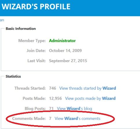
Since the new design was launched all members can now post their comments to published news articles, hotel reviews etc. Hence why we have also introduced a link to those comments, which is located under your profiles . See the image.
Quote: GWAESince you are allowing edit's again which I love, is there a way to have it put a little line on the bottom of the post says this post was edited. On other forums that I am on, as soon as you edit it, there is a little sentence added to the bottom of the post that indicates who and when it was edited.
don't think that should be a problem. Forwarding to our tech.
Since you are allowing edit's again which I love, is there a way to have it put a little line on the bottom of the post says this post was edited. On other forums that I am on, as soon as you edit it, there is a little sentence added to the bottom of the post that indicates who and when it was edited.
Quote: Zugadon't think that should be a problem. Forwarding to our tech.
Wait just a darn minute for me to Ketchup..;-)
I thought the rules changed to allow edits only for a very limited time on the posts that were posted after the announcement that the rules had changed...whew, that's a mouthful.
Have they changed again? Did I miss something?
Quote: GWAEI am pretty sure you can edit all again but I could be wrong. Sure some people don't want the edit thing showing but I think it is a good thing. There have been a few posts lately that I am pretty sure have been edited but I am not sure. Makes me wonder if I am misremembering things or people are editing.
People are definitely editing.
Quote: WizardofnothingYou may think it's a good thing but I do not thing everyone does
Who, me? I don't think it's a good thing. I don't think it even makes my top 100 feature requests. But I'm just one person. Not real fond of the accusatory side of editing posts here from time to time, either. I'd prefer people be able to edit, since they should stand by what they said, and sometimes that's unwise.
Quote: WizardofnothingNah babes I was talking to gwae who asked zuga to add the feature thinking everyone was for it
Since when did I say everyone would be for it. I said IMO it is a good feature and I stand by that. Whether others disagree or not, that's their perogative.
Quote: WizardofnothingNot arguing was just saying you asked if I could be added and zuga kind of accepted it- I don't think he considered some may not like it
Just curious why you think it would be a bad thing. Sure it's annoying to edit because of spelling and it says you edited. But when someone writes some thing and people comment then they go edit the original it makes other responses make no sense. At least if it was confusing but you saw the original posts was edited after the responses you could figure out what was going on.
Quote: DJTeddyBearIf the recent outbreak is any indication, the new site doesn't filter spammers too well.
Anti-spam is, and always has been to my knowledge, a manual operation.
Quote: Mission146I believe he's referring to the sign up process.
Ok. I misunderstood; you're talking about bots and captcha and that kind of filter, then. I'm talking about what seem to be humans, mostly in Asia, spamming us with garbage links for fake ID, fifa coins, women's lingerie, whatever that have to be banned/blocked/deleted/etc. Is there some way to filter them I'm not familiar with?
Wasn't there originally limitations for new people? If not, maybe there should be....
Quote: DJTeddyBearIf the recent outbreak is any indication, the new site doesn't filter spammers too well.
The new site is actually doing much better job, as the old WoV had no real spam protection. And if you refer to the outbreak which happened few months ago, then it was already been dealt with, given the new anti spam measures implemented at that time. Which reduced the bot spam to minimum.
As far as the real ( human ) spammers, that's where things are always bit trickier. We will look into implementing some posting restrictions in terms of links etc.
For what it's worth, I don't think enough people use / know the function of the Flag button
Just noticed a new admin, onwards and forward, a good move.