Poll
 | 34 votes (51.51%) | ||
 | 18 votes (27.27%) | ||
 | 5 votes (7.57%) | ||
 | 5 votes (7.57%) | ||
 | 4 votes (6.06%) |
66 members have voted
Probably green, and probably because it exists so frequently in nature.
Quote: WizardTrivia Time!
Which color is the human eye the most sensitive to? In other words, which color can it detect the smallest changes in hue?
For extra credit -- why?
Fans of the TV series Fargo need not respond.
I liked that show it was fun. Fargo will return for a second season, but rumor is it's about feminism, lots of female leads.Quote: Wizard
Fans of the TV series Fargo need not respond.
FYI 3 episodes of Better Get Saul is out. It's no breaking bad but i'm in.
Quote: ThatDonGuyIt looks gold and white to me - but if I turn the brightness down and the contrast up, it becomes black and blue.
Yah, we have a winner. Trick shot here. As published white and gold, and I'll give ya med. tan as a side option due to the photo-quality.
P-Shop it or P-edit it... yup, diferent colors. 'Solarize' the photo... you don't wanna know !
Trivia time answer
Answer #2 not based upon the rainbow is shades of grey, several more times as sensitive to subtle differences than any "color" such as the primaries/mixed primaries and those in between. It is a black-white-shaades of grey world... color optional.
Quote: DocYes, JB, I have seen such illusions before, but the image that you posted just doesn't work. I duplicated it and pasted one copy adjacent to the other to see whether the A and B squares matched or not. Clearly, they don't. I have done nothing to change the image, just copy and paste.
Or do we have another What-Color-Dress controversy here?
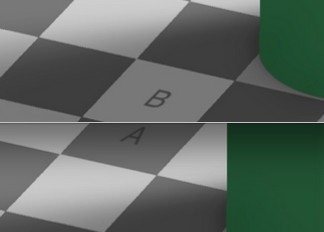
I don't know where the above image came from, but the colors in it are different from the original image. In the image above, A's color ranges from #353535 to #707070 whereas B's color is #777777. Square A is significantly darker than square B in your image.
In the original/authentic image, both A and B have the exact same hex RGB color of #787878. Whether or not they look the same color is the whole point of the illusion (they don't look the same yet they are).
Quote: EdCollins
Probably green, and probably because it exists so frequently in nature.
The answer is correct. The explanation given on the TV series Fargo was that our primate ancestors had to be able to detect anything hiding in the jungle, thus evolution gave us a keen sensitivity to the color green.
(I think the error was that he was inadvertently saving the file with a format that uses a lossy compression, instead of a lossless compression.)
Quote: EdCollinsJB, Doc's already aware of this. You must have missed it, but I brought this to his attention on page 3, post #436913.
(I think the error was that he was inadvertently saving the file with a format that uses a lossy compression, instead of a lossless compression.)
Actually, there has to be more to it that this. I can see a "problem" with the original image that JB posted, but I cannot show you the problem that I see because if I make a screen capture, you tell me that the captured/saved image has been altered.
Let me describe how I can demonstrate the "problem" on my computer screen without ever capturing or saving an image and let you try the same thing. Then, depending on whether you see the same thing as I do, maybe we will know better what is going on.
First, I open two browser windows (I am using Firefox 36.0 on a Mac), and I open JB's post in each window. Next, I resize one window to make it narrower, so that the right hand edge of the window slices right through the critical A and B squares of the image. Then I position that window on top of the full image in the other window and align the A & B squares of one window to the A & B squares of the other window. In that position, it is clear that that the A squares in the two windows match each other and the B squares match each other, just as expected.
However, if I re-position the narrowed window so that its sliced B square is on top of the A square of the other window, then that B square is noticeably lighter than the A square underneath it. That is, a difference is obvious when I compare the B square in the image in one window to the A square of the exact same image in the other window without making any copies or saving any files in any kind of format -- at least it is obvious on my computer screen.
I just don't know any way to convey that image to you without facing the challenge that I have changed the color/tone of the image through the way I have copied, saved, and posted it here it. I can only suggest that you try the same two-window comparison technique on your own computer screens and let me know what you see there.
I also tried this two-window comparison on EdCollins's post with the combined A/B insert shown near the original image. When I place the B square of the original image portion of that post on top of the combined A/B insert, the B square looks noticeably lighter than either the A or B portion of the combined insert. It certainly appears (on my monitor) that whatever technique Ed used to create the A/B insert and paste it beside the original image somehow made the B portion of the insert darker than it was in the original image.
Take a look at what you see on your screen with that two-window comparison on each of those posts.
Quote: DocTake a look at what you see on your screen with that two-window comparison on each of those posts.
When I open that initial image with two different browser windows, and position the windows so that square A is directly over square B, I definitely agree with you that it does "look" as if A is darker than B.
I suspect it's still part of the illusion.
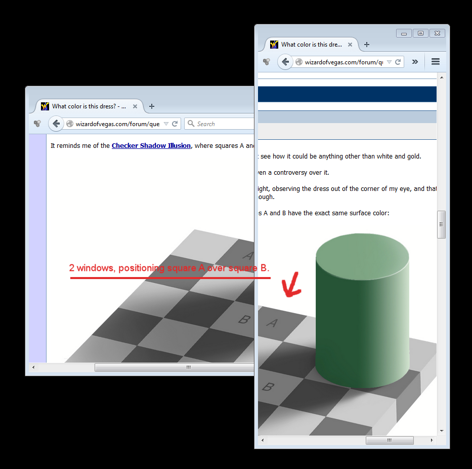
But note that if I do the same thing (use two different windows), but this time position the windows so that square B is directly over square A, it's much more apparent they are indeed the same color.
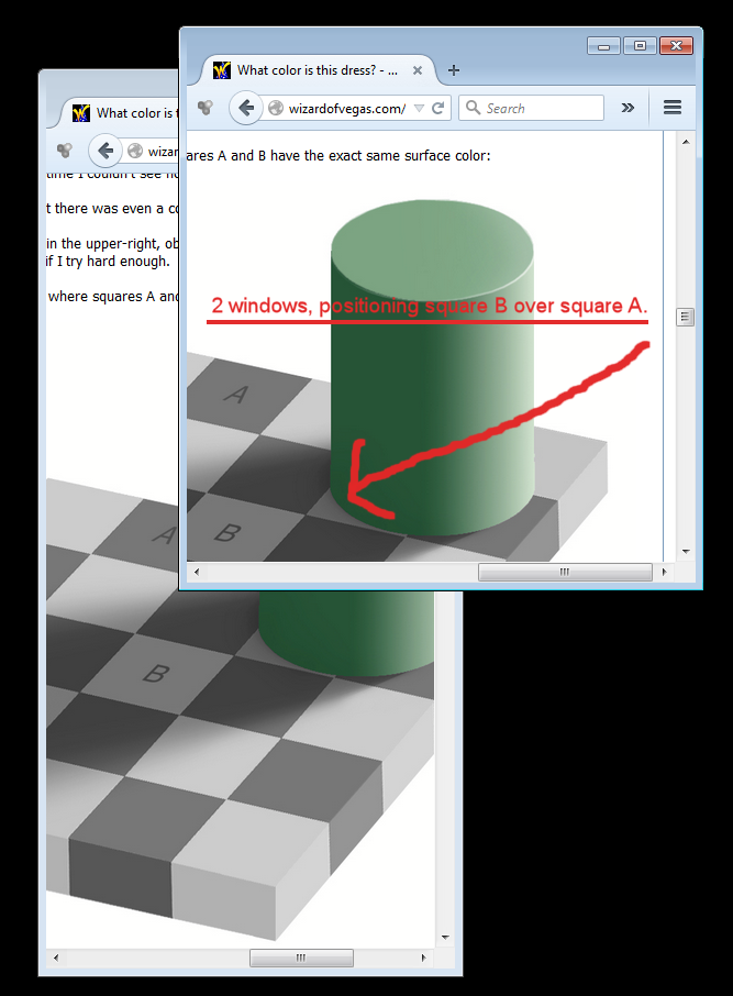
In both cases when I make a screen capture of my desktop, that includes the images of both windows side by side, using my Paint Shop Pro Dropper Tool and hovering it over the pixels, the program reports that the RGB color attributes are indeed identical.
I, for one, think it's a wonderful illusion.
Quote: DocI can see a "problem" with the original image ...
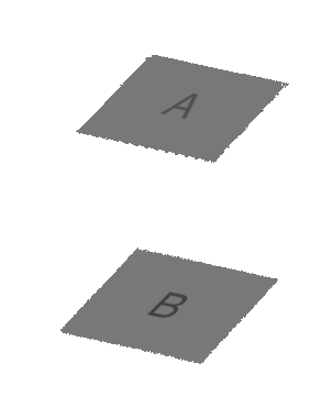
As with all illusions, that's the point. It's indisputable that the colors are identical, but the eye/brain refuses to perceive them as being the same with all that visual distraction.
If I erase everything but those two squares, then it becomes obvious:
Quote: rudeboyoiMentioning Fargo I prob would've guessed white (like snow) or red (like blood). But then maybe would've settled on red after thinking that white isn't a color but the absence of color? I've seen the show before but didn't remember that line in particular.
White light is the combination of all colors. White on something is the absence of all colors (pigmentation). Just sayin'...it can be either or both. White is highly significant in artwork, can be contrasting, denoting an absence, implying a junction of ideas/shapes/vision, background, isolating figures, obscuring, illustrative of ignorance or unknowable qualities, other things. I'm kinda into white; one of my favorite artists, Yaacov Agam, uses it extensively.
1. Open the image in "paint."
2. Use the pencil to draw too circles. Label them A and B.
3. Use the eyedropper to extract the color from square A and then use the paint can to spill it into circle A.
4. Repeat step 3 for square B.
Here is what it looks like:
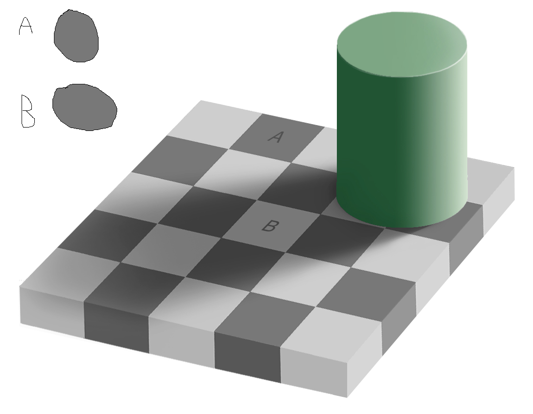
A question for the forum -- do we need that green cylinder for the optical illusion to work or is that a red herring?
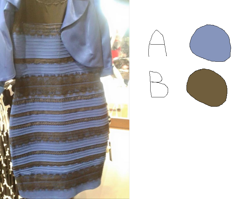
Now here is just the color circles dropped out:
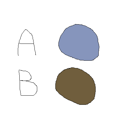
If you look at just the second image, what color do you see. For me it is still black and blue, although the "black" looks like very dark brown. I still don't know if this comes down to the background lighting or we just perceive colors differently.


