
New logo poll
Thread Rating:
Poll
| 2 votes (2.53%) | |||
| 2 votes (2.53%) | |||
| 35 votes (44.3%) | |||
| 6 votes (7.59%) | |||
| 29 votes (36.7%) | |||
| 5 votes (6.32%) |
79 members have voted
Image 1
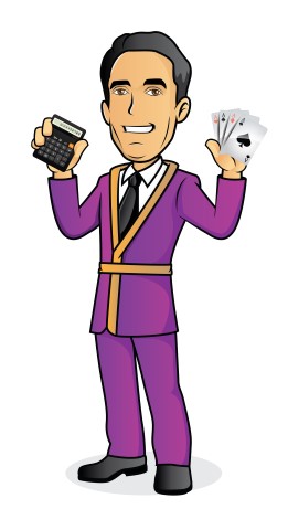
Image 2
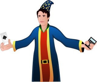
Image 3
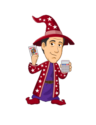
Image 4

Image 5

I voted for #1 - the Hugh Hefner version - very Vegas
#5 is good, but the way the calculator is placed up by the ear, could easily be confused with a cell phone.
5 has a bit of the cool factor. I voted 5 for that reason.
I voted for bigot. #3 ties it all together. #5
looks like a game show host. The point
of a logo is instant product recognition. The
old Quaker on a box of Quaker Oats. Caesar
eating pizza on a Little Caesars box. You want
the logo to incorporate the Wizard of Oz theme
you chose, and #3 is closest to that.

#3 Wizard out of the hollow tree.
#4 could have Archie and Veronica standing next to it.
I'll probably vote #5 but haven't decided. Any chance there will be more to choose from?
#3 is my vote, just to help make sure #4 is outvoted [g]
Quote: odiousgambitI especially don't want you to use #4, it makes my skin crawl
#3 is my vote, just to help make sure #4 is outvoted [g]
#3 actually looks like a younger Mike.
Did these different artists collaborate? Each rendition has an old Texas Instruments calculator.
Quote: 1BBEach rendition has an old Texas Instruments calculator.
Lose the calculator, it's not connected to gambling
in anybody's mind. I didn't know what it was at first.
Have the character pulling the handle of a 1940's
Mills slot, everybody knows what that is.

Quote: strictlyAPcant understand why people are voting for 5 its not a good look- the artwork on 1 and possibly 3 is way better
+1
Quote: beachbumbabs4 is the one that looks the most like you, but I don't like the prizefighter robe.
It's the extra large eyes that bug me. Supposed to make you think he is a puppy?
Quote: odiousgambitIt's the extra large eyes that bug me. Supposed to make you think he is a puppy?
#4 is irritating, I want to punch the character.
Quote: EvenBobLose the calculator
I assumed it was a smartphone. Is it a calculator?
Quote: EvenBob#4 is irritating, I want to punch the character.
4 does look a disturbing amount like "where's Waldo".
Quote: odiousgambitI assumed it was a smartphone. Is it a calculator?
It's a tricorder.
Quote: WizardThe new boss is planning to change the logo of the site. Here are some renderings of me that different artists have done. Please vote for your favorite style. Don't go by the size of the image, dimensions, or how the drawing is framed. Instead, please go more by the style of the artist. Thank you.
Fleastiff commenting on style? That's a hoot in itself!
Image ONE keeps the focus on the person with elements at the far sides being too indistinct to be instantly recognizable as cards and calculator.
Image TWO is good overall in that all elements are reconizable but that wizard's hat looks more like a 19th century sleeping cap.
Image THREE while very cartoonish is instantly recognizable and all elements are central with calculator and cards distinct.
Image FOUR is actually very good focus is on individual but looks more like card sharp wearing a bath robe than a wizard's get up.
Image FIVE is quite good but fanned card deck is not recognizable as such at first glance and face is downplayed.
FOUR would get my voted depending on what the artist's instructions were. He fell down on the "wizard" part but did everything else well, particularly face with associated elements of cards/calculator well done.
is effeminate to the point of being Gay.
Can you imagine Mike in a hoody like this?
You can only go two routes. A likeness of
Mike, which is almost impossible. Or a
caricature, like #3.
1943.

It will appeal to the Video Game (and newer) generation(s).
If I had to pick one it would be #5 but I agree it could use some adjusting, but what do I know?
You need some combination of the appealing-ness of #3 with the quality of #4. Ask for a redo.
t think, facially, only #3 looks like Mike.
#5 is a cross between a cheap magician and a game show host.
#1, #2, #3 and a little bit #5 looks like the calculator and cards were copied from another source. They don't match. The cards in #1 is the worst rendering / best example of my objection. Only #4 is it obvious that the artist drew the cards and calculator himself.
I like the robe and hat of #3. Conversely, #4 looks a little like Obi Wan Kenobi.
I DO like the plain clothes, and sneakers, of #4. Just fix the robe and hat.
I don't get the objection to the calculator, particularly when there is no similar objection to the cards.
While I agree that Mike probably more likely reaches for a computer for complex stuff, and a pencil and paper for simple stuff, the calculator makes sense, for the design and intended use of the logo.
On the other hand, the cards rub me the wrong way. I'd change it to a BJ strategy card.
Wasn't there a "Wizard" caricature on the old version of the site? Why not use that one?
#4 is awesome, if you are a gentleman rapist.
My vote is #4
Since #3 and #5 are most popular...in #3, you look like a gnome. In #5, you look like Burt Wonderstone. #3 would be better if your head was smaller...#5 would be better if you were less flashy.
#1 Looks to me a bit like Steve Wynn, but I would ask the artist to draw in an elbow through a Picasso painting and to offer that to them for THEIR new logo.
So, from the choices, #3 it is !
#2 - Just odd. You look like my neighbor's 4yr old. I can't get passed it.
#3 - Starting to look more like you, if you were older and fatter. Not a fan, overall.
#4 - Just no. The hair is a non-starter. Beyond that, you look like a FF mage.
#5 - Best likeness, most serious. The robe reminds me of the Nordiques, but that's probably just me. I vote #5.